That time we created modern book subscription for Cappelen Damm

Cappelen Damm is Norway's biggest book publisher
Key challenges
- Book subscriptions are complex offerings that need to be conveyed on small screens.
- Customer unfriendly solutions characterises the services.
- Custom setup and distribution is time consuming
Desired outcomes
- Higher conversion rate
- Reduced time to market on subscriptions
Cappelen Damm went through a digital transformation. Our goal was to modernise their book store, subscription services, and related platforms.
History of book subscriptions
For a long time, book subscriptions and book clubs were cutthroat and customer unfriendly domains: Customers would consistently be lured in with a cheap, often unrelated bait offer (e.g., a blender or a headset). This came at the cost for the customers, as they’d have to stay on for a few months. This also came at a cost for the companies, as they started to attract people who were after free appliances and not books. Customers became adept at getting the free stuff without paying and the companies had to start building guardrails and systems to stop them. Historically, managing your subscriptions plans were done through customer support too, to make it tedious and hard to cancel.
Moving away from the article format
My job was to create a product page for the subscriptions that would convert more people. In the past, the subscription pages read more like long articles. Looking at analytics data, we discovered that users fall off on their way down to the bottom of the page. Customers did not get the whole message, since the message was spread over a long scroll. Additionally, setting up custom article pages for a book subscription (they had several of them) was a time consuming task performed by the marketing team.
Standardised pages that convert
My hypothesis was that we could reach the desired outcomes by creating a master page template that consumed standardised information about subscriptions and transformed them into something good. This could happen without special intervention or manual labor form content creation teams. If possible, content creators could spend more time on actual ad hoc campaigns and articles. Product pages for subscriptions would sort themselves out.
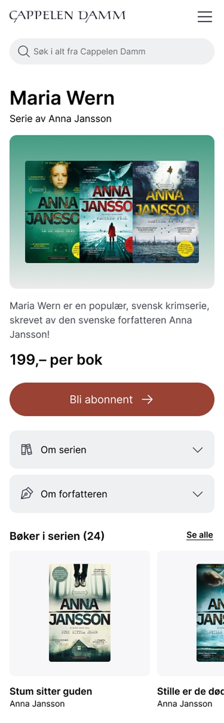
Luckily, we were in the process of designing and creating book pages for Cappelen Damm’s main book store at the same time. Therefore, we were able to leverage this into a product page that worked for both types of products. Since subscriptions are a bigger commitment and more complex, we split the information in three main parts: the hero, the accordions, and the rest.
The hero image
This is based on the first books in the book series and indicates that this is a set of books that you are looking at. The background colour takes shape based on the vibe of the series and will be different for each series. This was a deliberate choice based on the nature of book series. Book series are usually highly genre heavy (crime, romance, fantasy ++). This means that colours can be a part of building the feeling of universe and belonging.
Transparency
The product page also comes with more transparency, as information was easier to find and in the same place on all products. We chose this consistency deliberately. This consistency and transparency was also a shift from the previous direction, where information would be spread unevenly around long article pages, leaving customers in the dark.
Conversion and payment
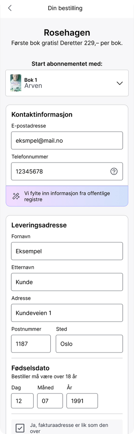
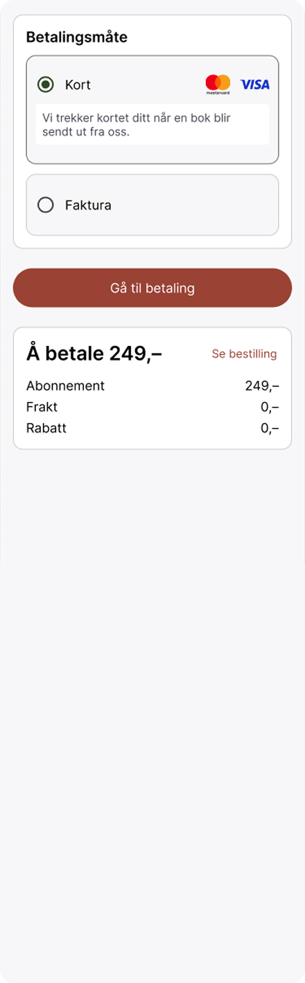
In the moment of purchase, this is a much bigger commitment than buying a single book. We made it simple, by assembling a custom order flow for all subscriptions. Users could only buy one at a time, and we had some real estate in the top of the screen to highlight special deals or any crucial information about the subscription.
Result
In the end, conversion doubled with this new design direction. Conversion meaning from page visit to purchased good. Cost of production fell too, with the reduced demand for manual labour in page set up and overhead.